Email is great when you have your customer or members’ email address. But what happens when you don’t have an email address? Do you just stop communicating altogether?
Obviously not.
We’ve spoken with hundreds of banks and credit unions over the years, and we’ve seen millions of communications run through Core iQ. As it turns out, direct mail continues to be an effective form of communication. Especially postcards.
So here are 6 key elements of effective postcard design that we have seen work well:
1. Personalization
Everything marketing these days is about personalization – and that doesn’t exclude a well-designed print marketing postcard. In postcard design, personalization works two ways. First, you want to be sure you’re adding personal touches for the receiver, such as including their name in the salutation. Second, you should also use personalization for the sender of the postcard. If the postcard is coming from a specific banker or the branch manager, be sure to include their name, contact information, and a small photo, if possible.
2. Keep it simple
Postcards don’t provide much real estate, so it’s important to make sure to use it wisely. That doesn’t mean cramming as much information on there as possible. Be intentional with your messaging and stick to simple design elements without making things too busy. You definitely want your postcards to be attention grabbing, but not overloaded with information that hides your offer and call to action.
3. Clear headline
A clear headline is a powerful headline. You want to capture your customers’ and members’ attention and make them want to continue looking over the postcard to learn more about the offer you’re promoting. Make it sound exclusive or solve a problem or pain point they may have. Your headline should reflect your one, central message, and direct the recipients straight to your call to action.
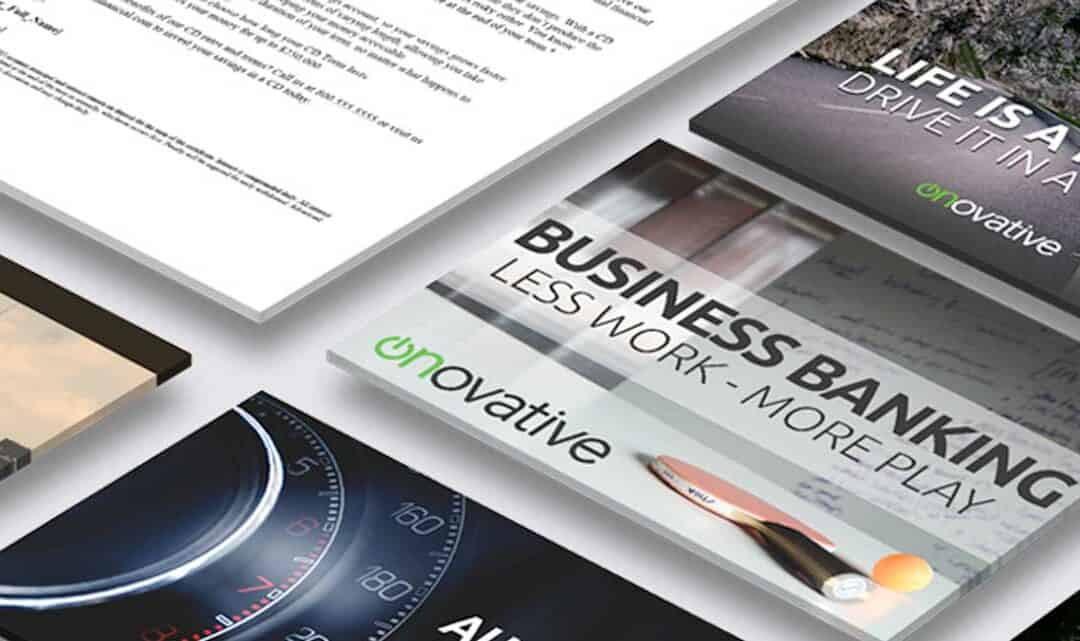
4. Stand out graphic
Use a captivating graphic on the front of your postcard. The graphic you choose should support your promotional message and not distract from it. Are you promoting auto loans? Use graphics that feature cars. Are you promoting mortgages? Use graphics that feature a new home. Be sure to pick one graphic and stick with it, then you can add your messaging to it where it makes sense.
5. The offer
When you highlight the promotional offer, make sure not only to focus on the benefits that your offer will provide to the person receiving the postcard. Create urgency with your offer without being too wordy (remember, simple is best). Bullet points can be a clean way to present benefits or offer highlights that stand out, while keeping things easy to read.
6. Call to Action
You must have a call to action. If there’s no clear call to action, then it’s difficult to get people to the next step, making your postcard promotion almost pointless. Whether it’s “call today for more information,” “go online and…,” or “stop by your local branch,” the call to action must be direct and prominent on your postcard. The best postcard offers we’ve seen to date all have a clear next step.
Designing direct mail postcards doesn’t have to be tricky and doesn’t always require a degree in design as long as you stick to these six elements of good postcard design. If you still need help or some more ideas, check out Onovative’s free downloadable postcard templates to help get you started.