As a marketer, time is our most precious resource and we’re always looking for an edge. We typically need to know where best to deploy budget to bring the right eyeballs into our online offers.
Google Analytics is an extremely robust tool, but sometimes it can difficult to know what you’re looking for or how to find it.
What if I told you that there was a single report in Google Analytics that can tell you exactly where your best sources of traffic are coming from?
Enter the Treemap Report.
The Treemap Report
The Treemap Report in Google Analytics allows you to visualize metrics using size and color. This comes in really handy when you want to quickly analyze data, because your eye naturally moves toward the most interesting information. Here’s more from the Google Analytics Help site:
The Treemaps report lets you visually explore trends in your Acquisition channels so you can quickly and intuitively develop hypotheses about your incoming traffic. Treemaps represent data as rectangles. The size and color of each rectangle represent different metrics, so you can combine different aspects of your data into a single visualization. Treemaps are a good hypothesis-generation tool because they can help expose the relative importance of, and the relationship between, different entities.
One Treemap Report To Rule Them All
Now that we know a little more about the Treemap report, how can it help?
The great thing about this report is that it’s customizable. So you can toggle custom primary and a secondary metrics to find views that are most interesting to you.
If you’re looking to be able to understand, at a glance, your best inbound traffic sources, then select “Goal Completions” for your primary metric and “Goal Conversion Rate” for your secondary metric.
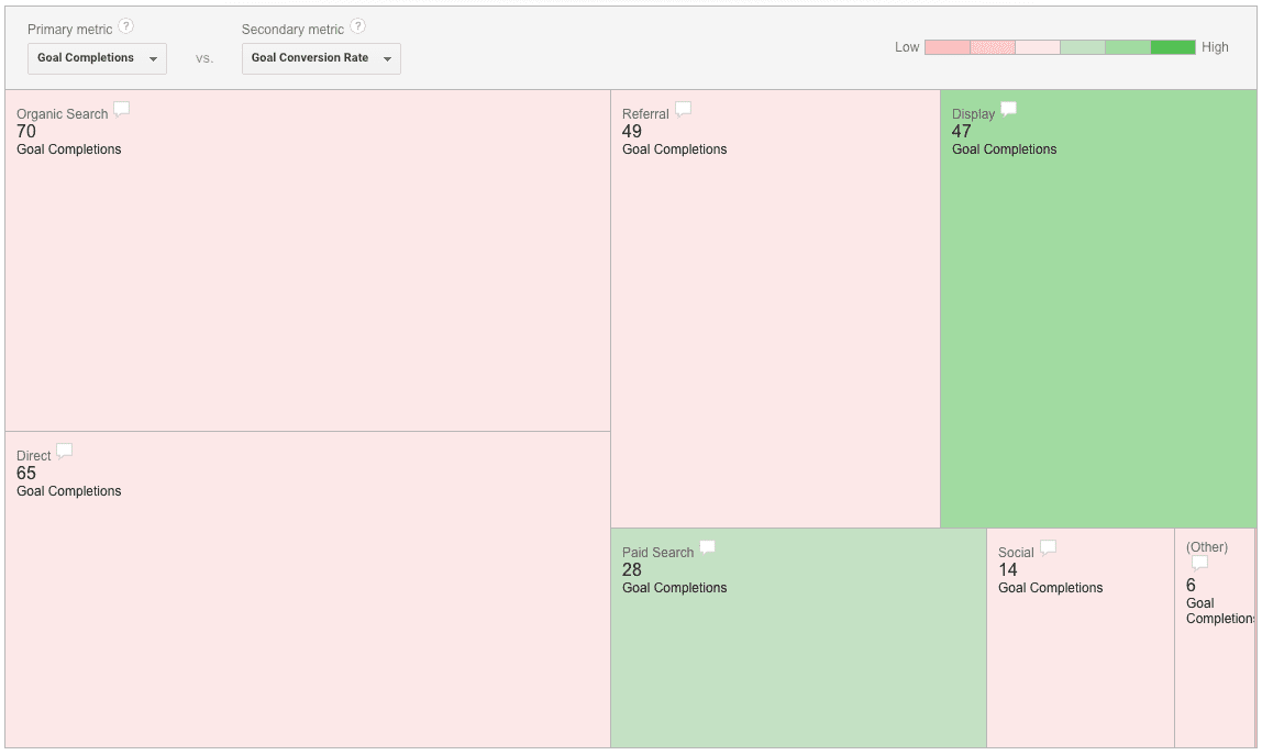
Doing so, will give you a treemap that looks like this:

In the Treemap report, the size of the block is related to the number of Goal Completions occurring over a given time frame, and the color of the blocks are related to the Goal Conversion Rate over that same time frame.
Ideally, your biggest blocks will be your best converting sources of traffic… but if they’re not, you can use this information to take action.
In the chart above, Display is the most efficient traffic source with regards to goal conversions because it’s the darkest shade of green. Organic Search is the best source for Goal Completions because it’s the biggest in size.
So What Does It Mean?
What I love most about this report is that it is actionable. If you’ve got a big green square, you’re winning at life and need to do whatever you can to keep that ball rolling. Here is a general guide of your next steps as a bank or credit union marketer after seeing two, more likely outcomes, big red squares and small green squares:
Big Red Square
A lot of conversions is great, but you’re missing an opportunity with a low conversion rate. In the example above, the biggest red square is coming from Organic Traffic. One way to improve would be to find out what pages convert the best and make more content around those themes. To do that, take a look at the Landing Page report and learn which pages are best at driving conversions. Look at number of conversions and conversion rate to figure this out. Now that you know what content converts best, the next step is to make more of it.
Small Green Square
You’ve got a good thing, and need to put more time and resources against this traffic channel. In the example above, both Display and Paid Search traffic are bringing in efficient goal conversions. Putting more budget toward these traffic channels should result in an increase in conversions. A logical next step is to add budget to these traffic channels.
How Do I Get To This Awesome Treemap Report?
Now that you’re convinced that this life-changing report can help you be a better marketer, you’ll need to know how to get to it. Fortunately, it’s straightforward and only takes a couple clicks.
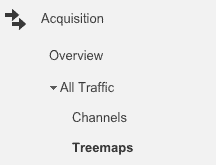
The Treemap report can be found in the Acquisition section of Google Analytics, so click “Acquisition” in the left hand navigation menu, then “All Traffic,” then “Treemaps” and you’re there.

Next set the Primary Metric to “Goal Completions” and the Secondary Metric to “Goal Conversion Rate” and you now have your hands on an extremely powerful report that will help you apply budget to marketing channels that you know drive results.

Now, go do great things.


